Cinematic Lighting in Blender: 3-Point Rigs, Rembrandt, Rim Light & Filmic Exposure
Lighting is not just visibility—it’s emotion, depth, and design clarity. If your render feels “CG,” the problem is almost always value structure, exposure, and light direction, not textures.
This guide teaches high-demand lighting workflows that concept artists use in Blender to create cinematic, readable images quickly—and iterate like a pro.
What you’ll learn
- The 3-point lighting setup used in film and games
- Rembrandt, Split, Rim, Kicker, and practical lighting patterns
- How to shape light with size, distance, falloff, and gobos
- Filmic exposure + contrast workflows (so your lights feel photographic)
- Fast iteration checklists (so you don’t over-light)
0. Before You Light: Fix the “Supermarket HDRI” Problem
A single HDRI often creates even, flat illumination—great for product previews, terrible for concept art.
Minimum setup (2 minutes)
- Keep the HDRI for ambient bounce… but lower its strength.
- Add a Key Light that clearly defines your subject.
- Add a Rim or Kicker for separation.
Goal: the viewer can identify your focal point at thumbnail size.
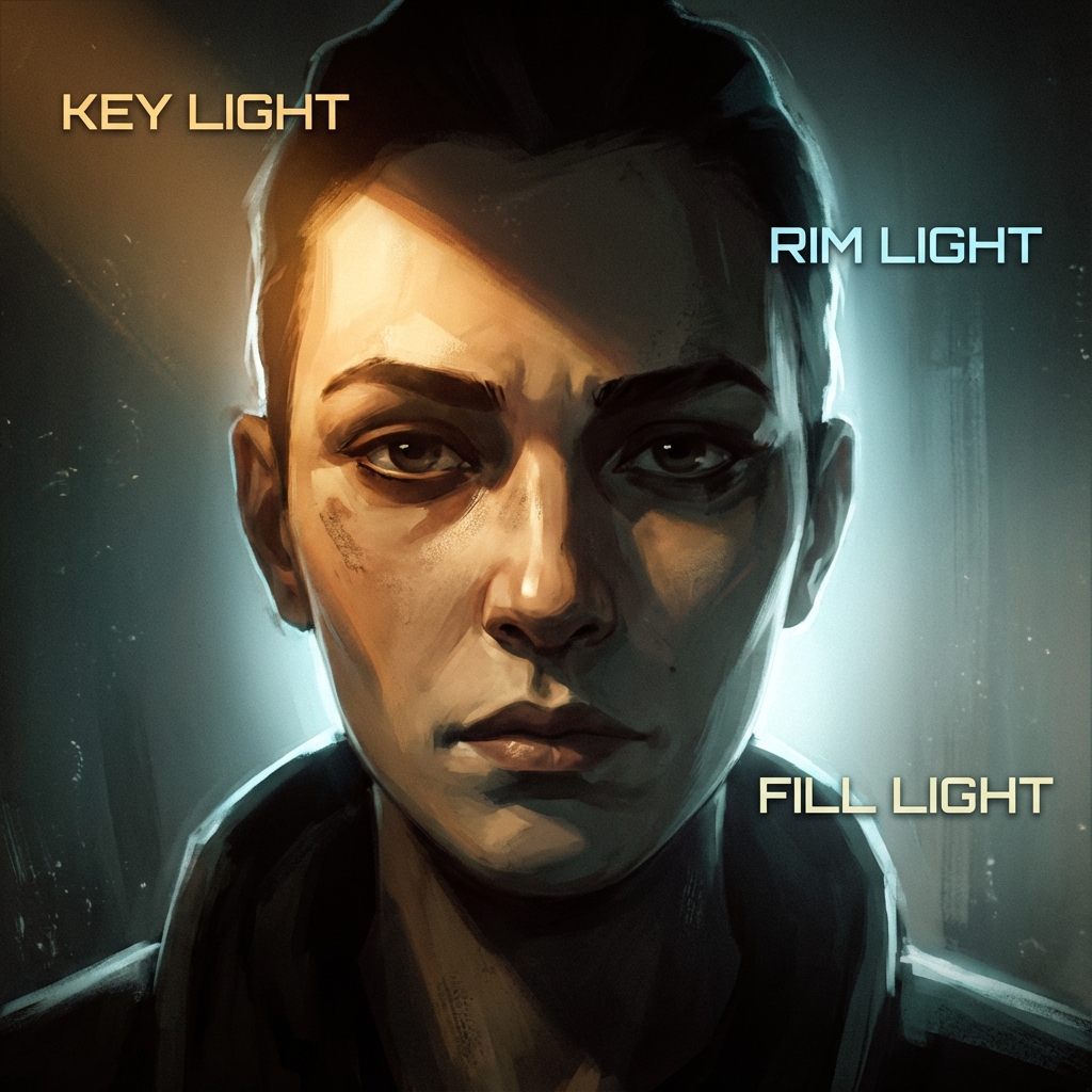
1. The Standard: 3-Point Lighting (The “Concept Art Default”)
3-point lighting is the fastest way to separate subject from background and define volume.
1.1 Key Light (The Story Light)
- Placement: 45° to the side + 45° above the subject
- Type: Area Light (soft cinematic), Spot (dramatic), Sun (outdoor)
- Strength: Start at 100% (your baseline)
- Color: Warm for intimacy (tungsten), cool for tension (moon/neon)
Blender tips
- Use Area Light for concept art 80% of the time.
- Increase Area size for softer shadows; decrease for sharper.
1.2 Fill Light (The Atmosphere Light)
- Placement: Opposite side of the key, closer to camera axis
- Strength: 20–50% of key (lower if you want drama)
- Color: Often cool (sky bounce) or a subtle complement to key
Pro rule: If you can’t tell where the key is coming from, your fill is too strong.
1.3 Rim Light (The Separation Light)
- Placement: Behind the subject, angled toward camera
- Strength: Often 150–250% of key (because it’s mostly hitting edges)
- Color: Either neutral white, or a contrasting accent (teal rim on warm key)
Common mistake: Rim light too wide. Keep it tight so it reads as an edge highlight, not a second key.
2. Exposure Like a Cinematographer: Filmic + “Light with Values”
If your image looks dull, it may be an exposure/contrast issue—not a lighting issue.
Recommended color management baseline
- Render Properties → Color Management
- View Transform: Filmic
- Look: Medium High Contrast (start here)
- Exposure: adjust until midtones feel natural
Pro workflow: lock exposure, then light
- Put your camera where you want it.
- Choose the mood (dark, neutral, bright).
- Set Exposure so the subject is readable.
- Now adjust light intensities relative to that exposure.
Why this works: You stop “chasing brightness” and start designing contrast.
3. Classic Lighting Patterns (With Practical Blender Placements)
These are high-demand “director language” setups. Art directors will literally ask for these.
3.1 Rembrandt Lighting (Drama + Form)
The goal: a small “triangle of light” on the shadowed cheek.
- Raise the key light high and to the side.
- Rotate until the nose shadow connects with the cheek shadow.
- Keep fill low (0–15%).
When to use: villains, tension, serious portraits, gritty character concepts.
3.2 Split Lighting (Mystery + Duality)
The goal: one half lit, one half in shadow.
- Place key light exactly 90° to the side.
- Kill or reduce fill.
When to use: anti-heroes, interrogations, cyberpunk, secrecy.
3.3 Rim Lighting (Graphic Silhouette)
The goal: silhouette reads even without internal detail.
- Place rim behind subject.
- Use larger light size for smoother wrap.
When to use: mechs, creatures, hero silhouettes, posters.
3.4 Kicker / Underlight (Tech + Threat)
The goal: catch undersides to feel imposing.
- Add a low-angle light (often narrow Spot).
- Use cool/alien hues for sci-fi tech.
When to use: robots, armored characters, horror beats, ominous lab scenes.
4. Light Shaping: The 5 Controls That Matter
These are the knobs that separate “I placed a light” from “I art-directed a shot.”
4.1 Size (Softness)
- Bigger light = softer shadows
- Smaller light = harder shadows
4.2 Distance (Falloff)
- Lights closer to subject fall off faster → more contrast and mood
- Lights far away feel flatter and more “studio”
4.3 Angle (Form Read)
- Side light reveals form (good for textures and shapes)
- Front light flattens form (avoid unless stylized)
- Back light boosts silhouette
4.4 Gobos (Shadow Design)
A gobo is a blocker pattern that shapes shadows.
In Blender:
- Put a plane between light and subject.
- Give it cutouts (alpha texture) or a procedural noise.
- Move it closer to the light for sharper patterns; closer to subject for blur.
4.5 Color Temperature (Mood Contrast)
- Warm key + cool fill is a classic cinematic split.
- Use subtle differences—too much becomes “RGB lighting.”
5. Practical Lights (The Cheat That Makes Scenes Believable)
Practical lights are visible sources in the scene: lamps, screens, signage, windows.
The workflow
- Decide what lights exist in the story.
- Place emissive meshes (screen panels, neon strips).
- Use hidden lights to boost them (because emissive alone can be noisy).
Pro trick: Put a small Area Light just in front of an emissive panel to “sell” the glow.
6. Fast Iteration Workflow (So You Don’t Get Stuck)
Professional lighting is iteration, not perfection.
6.1 A/B lighting variants in minutes
- Duplicate your key light:
Shift + D - Change angle + temperature
- Render thumbnails (small resolution) to compare.
6.2 Lighting checklist (printable)
- Is the focal point the highest-contrast area?
- Can you read the subject in grayscale?
- Is there separation from background (rim or value separation)?
- Are shadows intentional (not random)?
- Are practicals motivated by story?
7. Exercises (The Fastest Way to Improve)
- One-light challenge: Light a head/prop using only one Area Light. Get mood, then add fill and rim.
- Three moods: Same camera, same model—create Day / Night / Emergency Red.
- Gobo study: Make three gobo patterns and compare how they change the story.
FAQ
Do I need HDRIs? No. HDRIs are great for ambient bounce and quick realism, but cinematic lighting usually needs at least one deliberate key.
Eevee or Cycles? Eevee is faster for iteration; Cycles is more physically accurate. Use Eevee for look-dev and Cycles for finals.
Conclusion
Cinematic lighting is the fastest “quality multiplier” in concept art. Master a few rigs, learn to shape shadows, lock exposure with Filmic, and iterate with intent. Your renders will stop looking like previews—and start reading like frames from a film.
Next and Previous
- Previous: Composition & Mood: Directing the Eye
- Next: Set Dressing for Concept Art: Environmental Storytelling, Clutter Logic, and Lived‑In Detail
Related tutorials
- Blender for Concept Art: Speed, Scale, and Atmosphere
- Color Scripting for Concept Art: Gamut Masks, Palette Control, and Emotional Storytelling
- Mist Pass in Blender: Z‑Depth Workflow for Atmospheric Perspective in Photoshop
- Sci‑Fi Architecture in Blender: Greebles, Paneling, Arrays, Decals, and Scale Cues