Color Scripting for Concept Art: Gamut Masks, Palette Control, and Emotional Storytelling
Amateurs pick colors they “like.” Professionals pick colors that serve the narrative. Color is one of the fastest ways to communicate safety vs danger, intimacy vs isolation, hope vs dread—often before the viewer even understands the subject.
This guide is a production-friendly workflow for building a color script, controlling palette harmony with gamut masks, and designing an emotional arc that stays readable and intentional.
1. What Color Scripting Actually Is (and Why It’s Used)
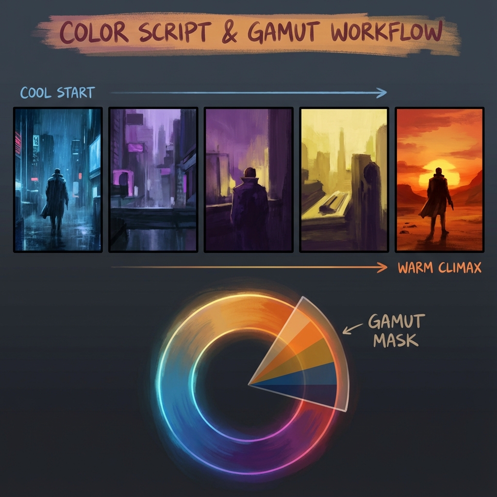
A color script is a sequence of small thumbnails that show how color, lighting, and atmosphere evolve across a story beat (film, game sequence, cinematic, trailer, or key moments in a level).
The purpose
- Continuity: scenes feel like the same world
- Emotional pacing: color supports the arc (calm → tension → release)
- Art direction clarity: faster approvals and fewer “make it moodier” revisions
What a color script is NOT
- A finished painting set
- A “pretty palette board” disconnected from value and story
Pro rule: color scripting is about decision-making, not decoration.
2. The Gamut Mask: A Palette Restriction Tool
The #1 cause of muddy color is using the entire wheel. A gamut mask is a deliberate limitation: you only pick colors inside a shape.
What the shapes do
- Small triangle (Analogous/Mono-ish): harmony, calm, realism, melancholy
- Long rectangle (Complementary bias): conflict, energy, drama
- Wide triangle (Triadic): playful, surreal, chaotic (use carefully)
A practical Photoshop setup (fast and repeatable)
Goal: enforce the mask so you can’t “accidentally” drift into rainbow chaos.
- Create a new document:
2000×2000(or any square). - Add a color wheel (image or your own gradient wheel).
- On top, create a layer called
Gamut Mask. - Paint black over colors you do not want (leave the allowed area visible).
- Keep this document open on a second monitor or side-by-side.
- Sample colors only from the visible area.
Pro alternative: make a palette strip inside the mask:
- Sample 10–20 key colors into a row of swatches.
- Paint using those swatches as your “locked palette.”
3. Color = Emotion (Build the Script)
Color scripting becomes powerful when you translate the story into visual decisions.
The 3-step translation
- Write the emotional beat (one sentence per panel)
- Choose temperature + saturation to match the beat
- Choose a lighting key (warm key/cool fill, neon rim, overcast ambient)
Example arc (generic but useful)
- Act 1: Normalcy / safety → natural greens/browns, moderate contrast
- Act 2: Threat / conflict → introduce an unnatural accent (red alarms, sickly green fog)
- Act 3: Peak danger → compress values, isolate saturation to focal point
- Act 4: Aftermath → desaturate, cool down, soften contrast
The most important moment: the transition panel (the palette shift). That’s where the story is felt.
4. Value vs Saturation (The Pro Controls)
If values fail, color won’t save it.
Key rules
- Value defines form (readability)
- Saturation defines importance (attention)
The “mud” diagnostic
If your painting looks muddy:
- You likely have high saturation in dark values.
Fix:
- Desaturate shadows.
- Push shadow hue toward cool (often blue/green), keep saturation for lights and accents.
Spotlight saturation (cinematic trick)
- Keep 80–90% of the scene in subdued saturation.
- Let the focal point get the “color budget.”
5. Palette Ratios: 60–30–10 (A Production Shortcut)
This prevents accidental rainbow distribution.
- 60% Dominant: atmosphere/background family (often desaturated)
- 30% Secondary: subject material family
- 10% Accent: story/focal cue (light, signage, magic, UI, blood, fire)
Pro tip: Make the accent color appear in one or two controlled places. Repetition creates design unity.
6. Color Script Workflow in Photoshop (Step-by-Step)
6.1 Set up a template
- Create a wide canvas:
6000×1500 - Add 6–12 boxes (panels)
- Label each panel with the beat: “Arrival,” “Discovery,” “Threat,” etc.
6.2 Work in grayscale first (optional but powerful)
- Block values quickly (2–3 values per panel).
- Confirm readability.
6.3 Apply color using Gradient Maps (fast)
- Add a Gradient Map adjustment on top of each panel group.
- Use your locked palette to define shadows → midtones → highlights.
6.4 Finish with a unifying grade
- Add a global
Color Balanceor subtlePhoto Filteron top. - Keep it light—color scripts should be clear, not overprocessed.
7. Common Mistakes (and Fixes)
- Mistake: every panel has a totally different palette
- Fix: keep a consistent base world palette; change one parameter per beat (temperature, saturation, contrast)
- Mistake: too many accents
- Fix: choose one accent per beat and repeat it with intent
- Mistake: high saturation shadows
- Fix: desaturate shadows, preserve saturation for lit areas
Exercises
- 8-panel emotional arc: calm → uneasy → danger → relief.
- Make 3 versions using different gamuts:
- analogous (quiet)
- complementary (dramatic)
- triadic (stylized)
- Pick the most readable and annotate why.
Next and Previous
- Previous: Set Dressing for Concept Art: Environmental Storytelling, Clutter Logic, and Lived‑In Detail
- Next: Blender for Concept Art: Speed, Scale, and Atmosphere