The Concept Art Presentation Deck: Selling the Design
In concept art, communicating your thinking is as important as the final image. Art Directors and production teams must understand how your design functions, not just how it looks.
This guide shows how to structure a professional-grade presentation deck—whether for internal review, pitch meetings, or your portfolio.
1. Core Layout Structure
Use a mid-grey canvas (50–60% brightness) with consistent spacing and hierarchy.
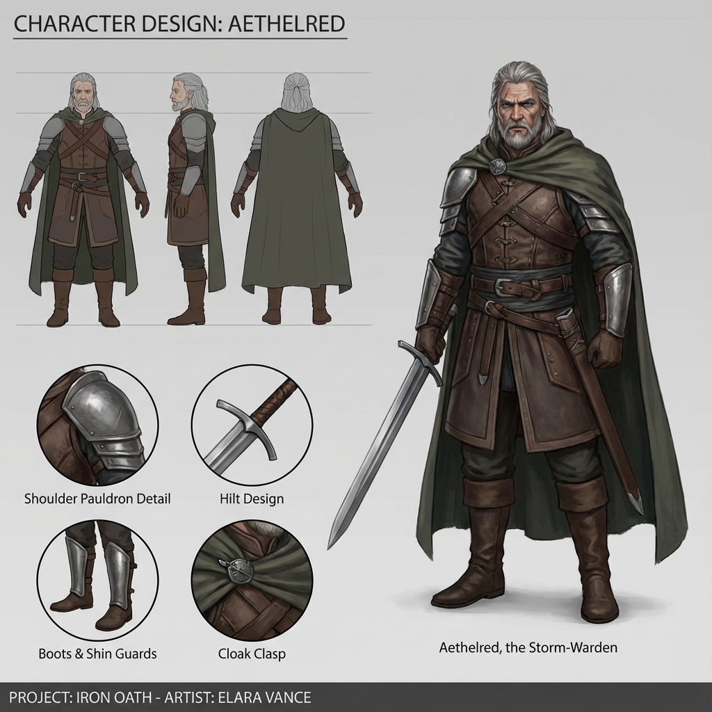
Recommended Sections:
- Hero Shot — Full-color final illustration showing the design in context.
- Orthographic Views (Ortho) — Flat, unlit front/side/back/3⁄4 views for modeling.
- Callouts — Cropped close-ups of complex parts.
- Material Swatches — Real-world references annotated with labels.
- Process Stages — Thumbnails, blockouts, iterations.
- Annotation Layer — Arrows and notes for function or construction.
2. Creating Orthos in Blender
Accurate orthographic views = faster modeling handoff.
Steps:
- In Object Mode, hit Numpad
1,3, or7(Front/Side/Top) - Hit Numpad
5to switch from Perspective to Ortho - Use
FlatorWorkbenchviewport shading for clarity View > Viewport Render Imagefor high-res exports- Repeat for each view and layout side-by-side in Photoshop or Figma
Pro Tip: Overlay a faint grid for size consistency across objects.
3. Effective Callouts
Use callouts to highlight mechanics or small-scale details:
- Zoom Renders: From Blender or Photoshop
- Arrows: Use vector arrows (consistent thickness)
- Text: Brief, clear labels (10–14 pt sans-serif)
Examples:
- “Carbon vent system—vents hot air out back”
- “Detachable stock locks into side hinge”
Avoid: Overexplaining or long paragraphs—treat labels like UI elements.
4. Communicating Process
Showing the work behind the work demonstrates reliability, not just talent.
Include:
- Silhouette Thumbnails — e.g., 8–12 explorations
- Line Exploration — early cleaned sketches
- Blockout Screenshots — greybox in Blender
- Material Tests — shader or photo overlays
Place process items in chronological lanes to show evolution. Consider using numbered stages (e.g., Step 1, Step 2…).
5. Typography, Spacing, and Branding
Presentation design should support, not distract.
Guidelines:
- Font: Use modern sans-serif (Roboto, Inter, Helvetica)
- Title Sizing: 24–30 pt; Subheadings 16–18 pt; Body 12–14 pt
- Spacing: Leave room between sections (use 1–2x font size as padding)
- Color: Use 1–2 accent colors max. Greyscale is safe.
- Your Name: Bottom corner, small and clean. Include contact and project name.
Final Checklist
- Neutral grey background
- Final illustration + orthos
- Labeled callouts for function or material
- Process thumbnails and blockout
- Consistent type and layout
- Contact info + watermark/logo (optional but subtle)
Bonus: Presentation Tools
- Photoshop: Traditional layout and export
- Figma: Fast prototyping with snap alignment
- PureRef: Gather visual references for swatches
- InDesign: For formal multi-page decks
Conclusion
A well-formatted presentation deck turns your artwork into a usable production asset. It bridges the gap between concept and implementation—proving you’re not just an artist, but a problem solver ready for a pipeline.
Next and Previous
- Previous: Mastering Photoshop for Concept Art: The Essential Workflow
- Next: Mastering Photobash Integration: Beyond “Soft Light”
Related tutorials
- Production Sketching Thumbnails: The “Idea Vomit” Workflow for Fast Concept Design
- Render Recovery in Photoshop: Fix Lighting, Pose, Materials, and Composition Without Re-Rendering
- Breaking the CG Look: Pro Paintover Workflow in Photoshop (Smudge, Mixer Brush, Grain, Edge Control)
- Painting Skin for Concept Art: SSS, Facial Color Zones, and Realistic Specular Control