Mastering Photoshop for Concept Art: The Essential Workflow
Photoshop is the industry standard for a reason, but using it for concept art requires a different mindset than graphic design or photography. Speed, iteration, and flexibility are your currency. If a client asks to move a mountain or change the lighting from noon to sunset, you shouldn’t have to repaint the entire image.
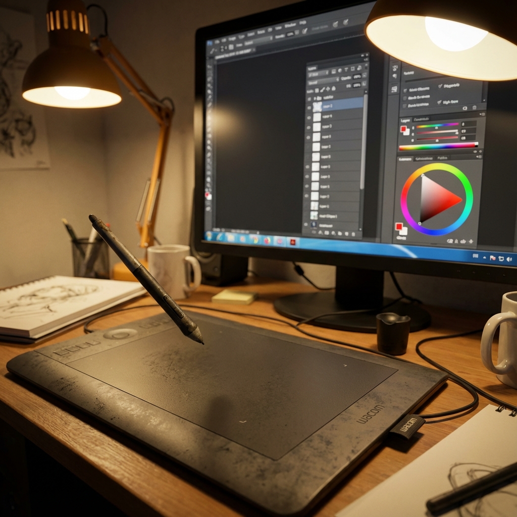
This guide covers the foundational techniques to keep your layer stack clean and your art professional. Whether you’re a beginner learning to navigate brushes and layers or an advanced artist refining cinematic compositions, this workflow ensures your output is flexible, fast, and focused on storytelling.
1. Organization is a Skill, Not a Preference
A messy layer stack isn’t just annoying; it destroys your ability to iterate. A foundational skill for both beginners and pros is maintaining a tidy stack to ensure changes can be made without losing work.
- Workspace Setup: Don’t rely on the default “Essentials” workspace. Configure a custom layout that keeps your critical panels—Layers, Brushes, Properties—open and accessible at all times. Save this setup as your default so every new document starts with your optimized layout.
- Logical Grouping: Name your layers clearly and consistently. Use folders to group elements (e.g., “Environment / Sky / Clouds” or “Character / Clothing / Armor Highlights”). Grouping your layers also makes it easier to toggle visibility and perform isolated adjustments.
- Color Codes: Photoshop allows you to color-code layers and groups. Use these to distinguish between elements (e.g., red for characters, blue for background) to enhance visual navigation through your stack.
- The Golden Rule: Never erase. Always use Layer Masks. Masks allow you to edit non-destructively, meaning you can always bring back pixels you “removed” later if the design direction changes. This is essential when clients or art directors request changes late in production.
2. Breaking the “Default Brush” Habit
While you can paint a masterpiece with a hard round brush, concept art demands speed. Professionals use custom brushes to quickly generate texture and detail that would take hours to paint manually.
- Simulation vs. Stamp: Build a library of brushes that simulate real media (oils, charcoal) or specific patterns (rock cracks, tree bark, skin pores). These accelerate your workflow and add organic texture.
- The “Cheat” Brushes: Stylized texture brushes—specifically for foliage, clouds, or grit—can populate empty space instantly and make your art stand out. These are ideal for environmental concept art where large surface areas must be painted quickly.
- Dynamics are Key: Dive into the Brush Settings panel and enable Shape Dynamics, Scattering, and Texture. Combine these with pen pressure to introduce natural variation that mimics traditional tools. This is crucial when aiming for painterly or impressionistic strokes.
- Brush Management: Use the Brush Preset Manager to group brushes into thematic sets (e.g., Hard Surface, Nature, FX). Label them with tags or use custom thumbnails to easily identify each tool’s purpose.
3. Strategic Photobashing
Photobashing—the art of merging real photos into your painting—is not cheating; it is a powerful technique to add realism fast. The goal is to build complex imagery with authentic textures in a fraction of the time.
- Perspective Matching: Before pasting a photo, ensure its perspective lines match your scene’s vanishing points. You can use the Vanishing Point filter or grid overlays to guide placement.
- Blending Modes: Don’t just paste a texture on “Normal.” Set texture layers to Overlay, Soft Light, or Multiply depending on the lighting condition. This allows the texture to blend into your painted forms.
- The Integration Mask: Paint into the layer mask to fit the texture to the form of your object. Use low-flow brushes or texture brushes to make the mask edge match the surface contour and lighting falloff.
- Lighting Consistency: Color-correct and relight the photo using Curves, Hue/Saturation, or Gradient Map layers to match your concept’s light direction, time of day, and mood.
- Unification: A photobash fails if it looks like a collage. Paint over the photographic elements with a low-opacity brush set to Color or Soft Light to blend photo and painting layers seamlessly. Use Noise or Grain overlays across the image to unify texture density.
4. Silhouette First, Detail Last
Great concept art starts with a read. If the viewer can’t identify your subject from its outline, no amount of detail will save it.
- The “Big Black Shape” Method: Use the Lasso Tool or a large brush to block in solid shapes. Zoom out to ensure the design reads at thumbnail size. This is where character, creature, and prop ideation starts.
- The Yona Saura Rule: As character artist Yona Saura notes, “if the silhouette reads, it works.” If your design still reads clearly in pure black, it will stand out in any lighting scenario.
- Iterate with Lasso: Use the Polygonal Lasso Tool + Fill shortcut (Shift+F5) to quickly test design variations. Combine this with the Transform Tool (Ctrl+T) to warp, scale, and rotate shapes for rapid exploration.
- Silhouette Thumbnails: Generate 10–20 silhouette variations before committing to rendering. This forces you to push proportion, gesture, and negative space exploration.
5. Controlling Value and Composition
A composition that doesn’t work in black and white won’t work in color. Values determine readability and focus.
- The Squint Test: Squinting or applying a temporary Black & White Adjustment Layer removes color distraction and reveals if focal points and depth are working.
- Value Grouping: Use sharp contrast for the focal point and subtle gradients elsewhere. This approach is similar to camera exposure—your subject should always be in proper lighting.
- Pop the Focal Point: Use Levels or Curves to increase value contrast where you want the viewer’s eye. Consider atmospheric haze to flatten the background and pop the subject.
- Graphic Read: Reduce your entire painting to five-value zones (black, dark, mid, light, white). Does it still read? If not, rework the composition.
6. Mastering Light and Atmosphere
Lighting should be modular and changeable. It’s easier to adjust layers than to repaint an entire key light.
- Adjustment Layers: Apply Color Balance, Hue/Saturation, or Selective Color to create mood. Stack them above your painting and group them into Lighting Passes (e.g., Dawn, Noon, Dusk).
- Gradient Maps: Create multiple Gradient Map layers with clipped masks to different zones (foreground, subject, sky) for nuanced color grading.
- The “Screen” Glow: For emissive light sources, paint on a new layer set to Screen with bright hues like cyan or orange. Use soft brushes and add Gaussian Blur for glow.
- The “Multiply” Shadow: Use cool colors on Multiply layers for ambient occlusion and cast shadows. Combine with Overlay layers to simulate bounce light.
- Atmospheric Perspective: Use low-opacity white-to-transparent gradients on top of background elements to simulate fog and depth. Apply noise grain on these to retain texture integrity.
7. The Final Polish (Post-Processing)
This is where a good image becomes a professional-grade piece.
- Bloom and Glare: Duplicate your highlights onto a new layer. Apply Gaussian Blur and set it to Screen or Linear Dodge. Adjust opacity to control intensity.
- Texture Overlays: Use scanned paper textures or photo textures set to Overlay/Soft Light at low opacity. This introduces subtle imperfections and breaks the digital cleanliness.
- Depth of Field: Use the Lens Blur filter or Gaussian Blur with masks to simulate depth. Sharpen the subject using Unsharp Mask or High Pass filters.
- Film Grain: Add a Noise layer with Monochromatic Gaussian noise. Set it to Overlay and adjust Opacity/Fill for realism. Optional: add a subtle vignette to darken corners and focus the eye.
- Color Grading: Add a Color Lookup Table (LUT) or gradient overlay. This helps unify scattered lighting and photo elements into one consistent atmosphere.
Conclusion
Photoshop is a powerful storytelling tool when approached as a layered, non-destructive design system. The techniques above reflect workflows used in major studios for games and film. By mastering layer control, brush efficiency, lighting modularity, and finishing polish, you’ll produce concept art that is not only visually compelling but also production-ready.
Treat Photoshop as a living document, not a static painting. Your stack should be flexible, reversible, and ready to pivot when the art direction shifts. That’s how professionals work—and now, so can you.
Next and Previous
- Previous: Painting Skin for Concept Art: SSS, Facial Color Zones, and Realistic Specular Control
- Next: The Concept Art Presentation Deck: Selling the Design